One thing to be clear about first: none of this is private data. It is read from published programmes, and the value is not that the figures are hidden — it is that reading 178 programmes and reconciling 4,878 people into distinct identities is work nobody wants to do once a year.
What if you could know which topics are trending over the last few years in conferences of your size, in or around your location, the patterns in which speakers take the stage, and how your own editions read against the practice?
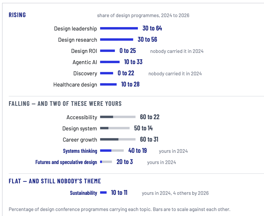
Rising, falling, and flat
Is this topic early, or third in a row?
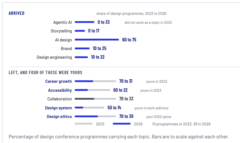
A topic that four in five programmes already carry is table stakes, not a draw. The index can tell you which subjects arrived, which are flat, and which the field has quietly dropped — as a share, so the growth in coverage is taken out.
Who has been on which stage
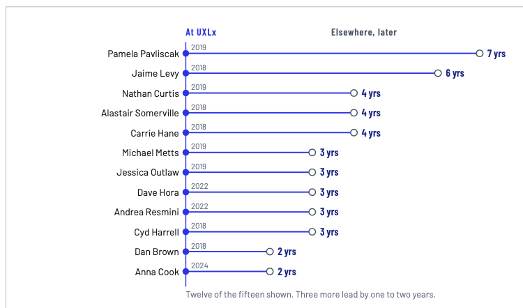
Which of your speakers appear elsewhere, where, on what, and how recently. Which of your peers' stages they have been on. And where your own programme had someone first, sometimes years before the circuit.
Our insights for each conference
Every conference is unique — its programme, its history, its theme, location and audience. So each report is read for that conference rather than run off a template. Five examples, from five different conferences.
The visual is specific for a conference, the numbers are taken from a set of five or six conferences in a specific region, and for one category of conferences.
Choose an example
What arrived, and what left
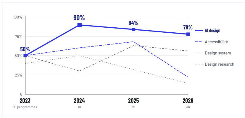
A topic over four years, as a share
Rising, falling, and flat
Speakers you had first
Is there a circuit to differentiate against?
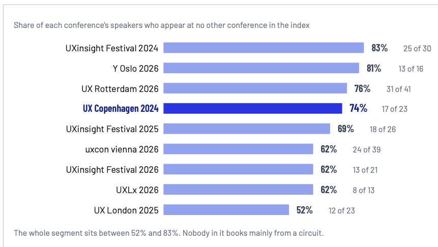
Every figure is read from an organizer’s own published programme — no attendee data, no revenue, nothing unpublished. Yours would be read the same way.
Want one for your conference?
Tell us which conference you run and we will read your programme against the practice. We will come back with what the index can show for your category and region, and what that would involve.